Filter
651
Text search:
dashboard
Featured
88
113
Language
Document type
189
180
82
61
40
29
26
24
9
5
3
1
Countries
30
23
22
22
20
19
18
18
18
17
16
14
12
12
11
11
11
11
11
10
10
9
9
8
8
8
8
8
7
7
7
6
6
6
6
5
5
5
5
5
5
4
4
4
4
4
4
4
4
3
3
3
3
3
3
3
3
3
3
3
2
2
2
2
2
2
2
2
2
2
2
2
2
2
2
2
1
1
1
1
1
1
1
1
1
1
1
1
1
1
1
1
1
1
1
Authors & Publishers
Publication Years
Category
305
25
22
19
17
7
1
1
Toolboxes
224
36
35
33
20
19
19
17
16
16
14
10
9
7
6
4
4
4
3
3
2
1
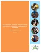
NAMIBIA (2012/13-2015/16)
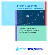
This guide is a revised edition to the previous version published in 2017.
This updated publication provides programme managers with a user-friendly tool that can: (i) analyse and draw conclusions from historic dengue datasets; (ii) identify appropriate alarm indicators that can predict forthcoming
...
Ebola dashboard RDC (EVD dashboard)
recommended
The WHO/AFRO Ebola dashboard has the most up to date numbers available.
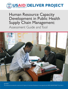
this toolkit presents a structured, rating-based methodology designed to provide a rapid, comprehensive assessment of the capacity of the human resource support system for a country’s supply chain. Data are gathered from a document review, focus group discussions, and in-country stakeholder interv
...
The HIV/AIDS Sustainability Index Dashboard is a tool completed every two years by President’s Emergency Plan for AIDS Relief (PEPFAR) teams, host government and partner stakeholders to sharpen the understanding of each country’s sustainability
...
COVID-19 vaccine market dashboard
recommended
An interactive tool for partners, manufacturers, and countries to follow the developments of the COVID-19 vaccine market with up-to-date information.
As the designated COVAX procurement coordinator and procurement agent, UNICEF has launched the COVID-19 Vaccine Market
...
PERC has developed a dashboard on Tableau to visualize multidisciplinary data and guide decision-makers on their country’s current performance of the COVID-19 response.
COVID-19 Vaccine Introduction Readiness Assessment Tool (VIRAT2), developed by WHO-PAHO, UNICEF, World Bank, Gavi, and other partners is a tool to help prepare countries for the introduction a COVID-19 vaccine.
It provides a roadmap for introduction and a structured framework for countries to self-
...
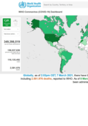
WHO Coronavirus (COVID-19) Dashboard Vaccination
recommended
Find out how many vaccine doses have been given in your country using WHO’s COVID-19 dashboard
Over 18 months into the pandemic, WHO continues to conductglobal surveillance of COVID-19as part of activities on preparedness, readiness and response activities. The need for global surveillance of COVID-19 is greater than ever, asthe implementation of vaccination campaigns and the appearance of va
...
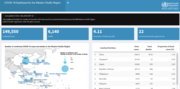
Global Food and Nutrition Security Dashboard
recommended
Interactive maps; country profiles and Studies
The Dashboard is designed to consolidate and present up-to-date data on food crisis severity, track global food security financing, and make available global and country-level research and analysis to
...
This dashboard includes the number of reported confirmed cases from countries/territories/areas of the WHO Western Pacific Region
This dashboard is a visualization of a study of global vaccine acceptance
This report uses the Food Systems Dashboard’s conceptual framework to
define and describe food systems. It summarizes the components, drivers,
and outcomes of food systems. The report also describes the food system
typologies used in the
...
Brazil Coronavirus(COVID-19) statistics. Total and daily confirmed cases and deaths.

Interactive Map
SCORE Dashboard
recommended
A technical package of five essential interventions with key elements to strengthen country health data and information systems and enable governments to track progress towards the health-related SDGs and national and subnational priorities.
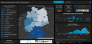
Robert-Koch-Institut COVID-19 Dashboard
recommended
Detaillierte Fallzahlen in Deutschland: Dashboard
Eine detaillierte Darstellung der übermittelten COVID-19-Fälle in Deutschland nach Landkreis und Bundesland stellt das COVID-19-Dashboard (http
...